Affichage des articles dont le libellé est Déco/Design. Afficher tous les articles

mercredi 17 juillet 2013

Comparing Old European Kitchens with Today's Modern Style

European interior design and architecture have always been on the flamboyant side. They really play on the aesthetics while maintaining functionality at the same time. In short, European-inspired rooms are very beautiful to look at, but being pretty is not the only thing they can boast. These rooms last for a long, long time, as evidenced by the countless old homes all over the continent that have stood for over hundreds of years. Kitchens are most especially resilient through the years.

General Description


If you take a look at European rooms, it appears that many similarities remain between kitchens in the regency era and present-day ones. Things may have since toned down, but the underlying elements still remain.

Stone floors and large cupboards are traditional in a European kitchen. Photo by ChalonHandmade at Flickr.com

Stone floors and large cupboards are traditional in a European kitchen.
Photo by ChalonHandmade at Flickr.com

For example, a standard kitchen will usually have a stone floor. Kitchens preserved for hundreds of years would have stone walls as well, with hewn rocks mortared to look like large bricks. This is why if the kitchen is built from the ground up, designers will often incorporate a stone wall or archway into the room. These features contribute to the European feel of the kitchen. Some would even include a stone hearth.

Most European kitchens also have one or more kitchen tables at the center of the room. Benches or stools are tucked underneath, although most of the tables also double as storage units. Shelves and drawers are built beneath them.

Speaking of storage, kitchen cabinets are usually elevated from the floor. Some are even as high as a foot off the ground. There are plenty of cabinets above the counters too. All shelving units are subtle and designed in such a way that guests will not easily find the doors to open them. Hinges are concealed behind overlay details, drawer handles are unobtrusive and majority of the cupboards have doors.

Smaller appliances are tucked into cabinets. Photo by ChalonHandmade at Flickr.com
Smaller appliances are tucked into cabinets.
Photo by ChalonHandmade at Flickr.com

Counters with granite tops line the walls, and appliances that no longer fit into the shelves and overhead cabinets are placed neatly on top. You can expect that a large portion of the counter will remain vacant though since Europeans love using the space for preparing food. Italians, for instance, are known to knead dough and cut pasta slices atop their kitchen counters.

A kitchen island, which is big enough to serve as a kitchen table, with built-in shelving and stool Photo by ChalonHandmade at Flickr.com
A kitchen island, which is big enough to serve as a kitchen table, with built-in shelving and stool
Photo by ChalonHandmade at Flickr.com

There is also a kitchen island in a European kitchen. Sometimes the sink is found here, but with enough space left for food preparation or a basket of fruit.

The stove is the prime attraction of a European kitchen. Old-fashioned stoves are big and made of stone. They are built with stone vents that taper upward and through the roof. This is where smoke from cooking escapes out of the kitchen.

European kitchens tend to be bright and airy too, except for those that are built in the basement level. The windows are high up the wall, so there are fewer overhead cabinets and more floor-length cupboards.

Modern European Design Concepts


Interior designers will strive to preserve the traditional and trademark features of a European kitchen, and at the same time give it a modern look.

For people who are not fans of stone walls and floors, they can still have a European-designed kitchen even if the floors are paneled with wood. They just need to compensate by choosing wisely the furniture and accents in the kitchen. A kitchen island with counter and stools, for example, can lend a European touch to any kitchen.

Grow your own basil and other herbs in your kitchen. Photo by Brian Warren at Flickr.com
Grow your own basil and other herbs in your kitchen.
Photo by Brian Warren at Flickr.com

You can also take to hanging bunches of herbs above the island, like cloves of garlic and onion springs. Keep a pot of basil plant on the counter too, so you can just cut fresh leaves to garnish your dishes anytime. Many rustic, European households do this.

Of course, it is also possible for European houses to have themes different from the traditional style. Instead of a large stove, an ultra-modern kitchen will probably have one of those slim, state-of-the-art flat stoves with glass covers. The color palettes will also depart from the traditional warm tones in favor or all white, all black, or a combination of bright and quirky colors.

What Makes a Kitchen European?


In the end, the appearance of the kitchen matters less than the cooking activity going on in the kitchen. That is ultimately what makes the room feel European.

For example, if the homeowner is an avid fan of Italian cooking methods, he will arrange and design his kitchen in such a way that there won’t be anything that would disrupt the flow of his cooking. There will be a granite-topped kitchen counter, lots of spices in easy reach (meaning they are displayed in open cupboards, if not permanently placed on the kitchen table), and a large stove and oven.

Tina (picture)

Tina Madsen is a design enthusiast who brings her passion for modern décor and writing to her role as the NowModern.com blogger.  She also specializes in turning small living areas into spacious social hubs with bar stools and counter stools

lundi 24 juin 2013

A Passion for Vintage Style - Purple Spaces

Hi, I'm Susi from the Arcadian Home Blog where I write about lighting trends and decorating ideas using amazing home decor and light fixtures. In both fashion and décor, smoky purple is a stylish choice. Smoky purples can range from reddish plums to silvery lavenders. The darker shades of smoky purple are often called plum. Whatever you call it, smoky purple makes for a stylish color in decor and decorating.

Purple Interiors


Smoky purple walls and upholstery give this living room a sophisticated look. Smoky purples can range in hue from deep to plum to lavender, and this vintage round mirror adds a decorative element to the space.

Purple Interiors


Love the dusty, smoky purple of the curtains in this formal antique filled room. Smoky purple is gorgeously paired with browns and golds in the form of buffet lamps and soft textures.

Purple Interiors


There is a huge range in colors that fall into smoky purple. Love the purple upholstery on the sofa in this atmospheric room. It has a nice cool grey undertone to the color.

Purple Interiors


Like most deep saturated colors, smoky purple looks great paired with lots of white. If you paint a wall a smoky purple, offset the dark color with white trim, and perhaps add in vintage bathroom light fixtures for character.

Purple Interiors


Smoky purple pairs well with metallics in silver and gold. Along with white, metallics in lamps and furnishings can bring light to a darker color on the walls or upholstery.

Purple Interiors


Smoky purple can also be used as a neutral when paired with brighter versions of cool colors. Smoky purple with aqua has a lot of energy, while smoky purple and navy would be more dramatic.

Purple Interiors


Some smoky purples are more smoke than purple, like this wall color. Purple tinted grey is a gorgeous neutral choice for walls. Amazing contrast between the taxidermy on the wall and the sparkling chandelier.

Purple Interiors


Smoky purple, or plum, can also be paired with warmer tones, like pink. Dark and dramatic, plums and smoky purples are sophisticated colors. Images 1 | 2 | 3 | 4 | 5 | 6 | 7 | 8

What do you think of these purple color inspirations? Don't forget to visit our blog for more home accessories and decorating ideas!

lundi 10 juin 2013

What Is Eco-Paint And Why Is It Important

Green paint or eco-paint as it’s often known is becoming increasingly popular as an option for decoration at home.

Of course, there are a number of reasons why people tend to choose green paints over the traditional sort. Conventional paints are full of VOCs, otherwise known as volatile organic compounds. These are known to cause all sorts of issues with health and the emissions that come from them last for years.

These compounds are added to conventional paint to speed up the drying time and also the thickness and coverage of the item. However, there are plenty of raw and natural alternatives out there that have similar benefits and have been in existence for hundreds of years.

VOCs

VOCs as we’ve mentioned are blended into traditional paints to allow it to be more effective as paint. These cause a number of problems however; the VOCs are bad for the respiratory system and can cause a range of illnesses.

One of the biggest things to look out for when purchasing paint of this sort, is the incidence of paint companies posing as a green option to paint buyers. There are limits to the amount of VOCs that can be placed in paint, however many companies will lower these to relatively miniscule levels and then sell paint as a green alternative. This is not the case and many of these reduced VOC paints still contain a number of toxins and are still bad for health and for those that have to spend time around them.

Green Paint

There are plenty of paints that have low levels of these toxins, though only eco interior paint has none and very little or no environmental impact. These paints are free of all the toxins, VOCs and plasticizers that come in other paints and will not cause damage to your home or the people who live there.

If you are looking for these eco paints you will often find they are accredited by green companies who have tested them to be of the very highest standard and will certify their green credentials. This is something of a benefit and will showcase the differences between these completely VOC free paints and paints that merely have low VOC content and still cause damage.

These paints are often made from foods and proteins found in things such as milk, lime and also plants. The will be non-toxic and are eco-friendly. The paints are tested to the highest standard and in most cases are found to be almost as durable if not equally as durable as many of the traditional paints with high levels of VOCs. These paints can be used in everything from compressors to the end of a brush too.

This means that there is little or no excuse to purchase the alternative. They also don’t cost a significant amount more than the paints with high levels of VOCs, cementing their place as a choice for people looking for paints.

Purchasing eco-paint can really make all the difference to your home, health and that of your family and should be considered for your next project.
James Smith has written a number of articles on eco paint and is a lover of the environment and also DIY and often paints his furntiure using eco-paint and compressor hiren Bestahire.

vendredi 12 avril 2013

Relooking d'un mur de mon bureau

Lors du weekend pascal dernier, le temps était tellement gris que je suis  restée à la maison ...

En fait non, il a fait beau mais je suis comme même restée enfermée pour relooker mon bureau. Dingo, n'est-ce pas?!

Rangement et ordre


J'ai besoin d'ordre pour bien travailler. Et donc il me fallait des étagères pour ranger mes papiers et autres outils de travail ... mais aussi pour mieux disposer mes poteries vintages. On ne se refait pas n'est-ce pas! ;-)

C'est ainsi que j'ai placé des étagères vintage et allemandes de la marque "Element System". Cette marque existe toujours mais mes étagères datent des années 70. Je les ai achetées chez Troc International pour 29 euros. La bonne affaire !

[caption id="" align="aligncenter" width="400"]Element System - Les planches Element System - Les planches[/caption]

[caption id="" align="aligncenter" width="400"]Element System - Les barres et équerres métalliques Element System - Les barres et équerres métalliques[/caption]

[caption id="" align="aligncenter" width="400"]Element System - La première pose de la première barre métallique Element System - La première pose de la première barre métallique[/caption]

[caption id="" align="aligncenter" width="400"]Element System - Les équerres posées ...cela donne. Element System - Les équerres posées ...cela donne.[/caption]

[caption id="" align="aligncenter" width="400"]Element System - Le tout posé. Element System - Le tout posé.[/caption]

Je suis très contente du résultat. Le noir, le bois et le mur vert se marient parfaitement. Une atmosphère vintage que j'adore!

[caption id="" align="aligncenter" width="400"]Element System - Le résultat final Element System - Le résultat final[/caption]

Qu'en pensez-vous?


Sources Photos: Faites par MesDécoVertes. Demander accord au préalable.

lundi 25 mars 2013

Des designers belges avec un amour du bois - Salon Bois&Habitat

Vendredi dernier je suis passée au salon Bois & Habitat (édition 2013). Ce salon avait lieu au Palais des Expositions de Namur (Belgique).

Juste à l'entrée se tenait un long podium mettant en scène des objets et meubles créés par des designers belges. Le dénominateur commun de tous ces objets design? Je vous le donne en 1000: le bois ! 15 objets, pour 15 ans d'histoire du Salon.

Les designers présents:

Mathias Van De Walle, Elric Petit, Irina Scrinic, Gaultier Poulain, Emmanuel Gardin, Michaël Bihain, Hélène Boularan dite LN Boul, François Dedeur, Nicolas Bovesse, Marina Bautier, Thierry Bataille, Kaspar Hamacher, Mathieu Gabiot, Gaëtan Van de Wyer et Jean-François Parisse.

Voici quelques photos:

[caption id="" align="alignnone" width="480"]Bois & Habitat 2013 - Designers Belges Bois & Habitat 2013 - Designers Belges[/caption]

[caption id="" align="alignnone" width="360"]Bois & Habitat 2013 - Designers Belges Bois & Habitat 2013 - Designers Belges[/caption]

[caption id="" align="alignnone" width="360"]Bois & Habitat 2013 - Designers Belges Bois & Habitat 2013 - Designers Belges[/caption]

[caption id="" align="alignnone" width="360"]Bois & Habitat 2013 - Designers Belges Bois & Habitat 2013 - Designers Belges[/caption]

[caption id="" align="alignnone" width="360"]Bois & Habitat 2013 - Designers Belges Bois & Habitat 2013 - Designers Belges[/caption]

Une mini expo en partenariat avec le magazine Déco Idées.

[caption id="" align="alignnone" width="360"]Bois & Habitat 2013 - Designers Belges Bois & Habitat 2013 - Designers Belges[/caption]


Sources Photos: Faites par MesDécoVertes. Demander accord au préalable.

vendredi 22 mars 2013

Creating The Perfect Vintage Home

Vintage is a lasting trend in both fashion and home-wares; from the house with a singular 1890s vase, perched on the mantel, to a terrace crammed to bursting with 50’s Americana.

Vintage Home Interiors


It’s best to start with the basics. A house from your chosen time period is a good blank canvas. From here you can use vintage decorating materials to adorn your home. There are dealers who sell vintage wallpaper, paint and curtains; curtains in particular are highly sought after. In terms of colour and style, consider the room you will be decorating. Small rooms will look tacky if crammed with memorabilia, while larger rooms can look cold and bare if minimalism isn’t achieved correctly.

Tips:


· Be careful with the paint however, as health and safety was not as stringent in the past as it is now, and some old paints can be toxic.

· Remember to steam curtains and any other soft furnishings to ensure pests are not brought into your home.

· Vintage fabrics tend to be delicate. Handle carefully.

Vintage Furniture


License: Image author owned

When your home is decorated to your satisfaction, it’s time to pick furniture. One of the cheapest – and most earth friendly – ways to do this is to buy old classics and have them professionally restored. A beautifully made chesterfield or vintage leather sofa can be worth thousands; the cost of re-upholstery is a small price to pay for restoring a stunning piece of retro chic which will be passed through your family for generations. Vintage Ercol furniture is particularly worth restoration; especially as the frames are carved from quality wood, and curve sensuously.

Tips:


· Check for woodworm on all wooden objects – the creature can decimate a house’s woodwork in very little time.

· Measure the cost of restoration against buying an item in better repair. Buying vintage is better than buying new, but some vintage items are too far gone.

· Keep vintage furniture out of bright sunlight if possible to reduce sun bleaching.

Vintage Home Accessories


JukeboxTheJointJune2008.jpg - Creative Commons

Time for the finishing touches - the little extras that give your home that real vintage sparkle. I would strongly suggest setting up a Pinterest board or using a notebook to gather clippings. You can get inspiration anywhere – a fascination with dark Americana means I love defunct / half blown neon signs, coca cola memorabilia and diner chic. There are hundreds of magazines extolling the virtues of the perfect plates to adorn a Welsh dresser, or where you can get an authentic absinthe trowel. Once you have a look you like, acquire pieces slowly. Going overboard, filling your home with cheap approximations, or wasting thousands on average tat simply because it bears the label ‘vintage’ – just say no.

Tips:


· Inspiration is key. Trawl Pinterest and ask friends for any old magazines.

· Hunt everywhere. Etsy, eBay, jumble sales, car boot sales, charity shops.

· Choose carefully. 5 exceptional pieces will have far more impact than 200 dancing Tiki girls.

Written by Helen Mitchell, writer for Plumbs Reupholstery.

lundi 18 mars 2013

Recycling Oak Pallets Into Furniture

Using Oak pallets is amongst some of the more unusual and unique ways of making furniture. Many companies may often be giving them away or selling them off cheap, as they have them in bulk quantities.

Considering the usual price of oak they can be a great bargain but of course you can’t expect them to be a top grade suitable for fine furniture. You can certainly make a nice piece of bedroom or living room furniture though.

Pallets are made to be strong and able to hold a lot of weight, so this also means they are fitted together extremely well. One blogger even likens them to being held together with ‘kryptonite’. Of course this is not the case but as intended and suggested they are hardwearing so the best way to use a pallet (if you do not need it in its original shape) is to saw it, rather than trying to disassemble it.

Other types of pallets would also be fine for making furniture; however oak will be more the hardwearing source compared to the likes of pine, so consider that when deciding on what you will make.

Pallet desk overall
Photograph of Pallet Desk by Pierre Vedel Via Flickr (CC BY-SA 2.0)

One of the easiest furniture ideas using a pallet, is to make a coffee table. If you take one pallet and add wheels to the bottom, it will make a very low table. Alternatively you can stack a few together, or add pieces of wood between two to make up the height. Then it’s up to you to pick a finish to suit your room. Bold colours can give the room a real colour pop effect and would look great in a loft style apartment. Or if you just lightly stain it, it will have more of a rustic feel.

Pallet Chair and Unit

Of course this twist on oak may not look great with expensive and well crafted oak living room furniture, but the use of pallets is endless and you can even make your very own decking.

The main thing here is you will need to lay them on a flat surface, so may need to do some groundwork first. But the idea is literally as simple as laying a few pallets down, fitting them together as closely as possible and waterproofing them with a decent wood sealant. You can also stain them whatever colour you like, and using something like a warm terracotta could brighten up your garden and give it a real Mediterranean feel.

Some of the more crafty types online have made toys, beds, cupboards and much more. Although these would not be the best choices for a novice, as they could be a safety risk. One wouldn’t want to be awoken in the night a collapsing bed!

J. Hawkes is a guest author and writes on a number of topics relating to DIY, recycling and the environment.  Hawkes regularly submits to a number of different blogs including National Furniture UK's where discussion is usually about Oak living furniture.

 License: Creative Commons image source

samedi 9 mars 2013

Tips for choosing the Perfect Colours when decorating - Guest blogging

Many homeowners feel overwhelmed and worried when choosing colors for their home, even though they one of the basic elements within decorating. Part of this is due to the wide variety of colors and shades; once you pick the color, there are many other decisions.

How light should the colour be? Will you get away with darker shades? Should you opt for warmer or cooler tones for the room? Is paint the best option or will another material, like fabric, work better?


The problems do not stop there. The impact will depend on the way that they are used and the type of room. Once you paint the walls, you may stand back and wonder if that really was the shade your selected. Too many people think that it means they have failed in decorating their home but it just means trial and error is required.

But how do various factors affect your decision and view afterwards?

The first consideration is the lighting when picking the samples or the type of material used to select the samples. Small chips of the color will not give the same view of a full wall or even the room. Different types of lighting in the home and using natural light will lead to the shades looking completely different than under the store’s tube lighting.

You will also need to consider the flooring, the colour of the ceiling and the furnishings around you. These can change the way the color looks and it may give an unflattering look.

That doesn’t mean you have to start using creams, whites and other neutral colors. Even the most professional interior designers don’t get it right the first time with every single job. The difference is they know how to take everything into account to get a rough idea that they can easily refine.

For help with choosing, use one of the tips from Better Homes & Gardens’ book, Colour: The Complete Guide for Your Home”. One recommendation is to start with colors that you know you like; you don’t need to know a lot about them to make them perfect.
There are other tips that the book offers to help you decide:

  • Be guided by your instincts. Your gut is a great way to make an instant decision. You can then refine the choices afterwards with some practice and theory.

  • Be guided by the colors of your clothes and furnishings. You will usually pick your favorite colors without really thinking about it. You could also look through various decorating magazines or books for style ideas and be guided by the ones that you like. Also, consider the architecture that you like as these often involve various colors that you can use.

  • Use the entry way of the home as way to bridge the gap between outside and inside. Earthy tones, such as greens and browns, can help to be ready for a step into the home or for getting ready to face the weather outside. This can be incorporated into other rooms around the house.

  • Do everything in stages. Doing it all in one go can lead to disaster, especially if you decide you don’t like the color. If you are working on many rooms in the house, focus on them one at a time to refine the process for choosing the color and make your home more personalized.

About the author: Stuart is an experienced builder in Sussex and runs Bem Builders LTD. 

mercredi 6 mars 2013

How Modern Design Influences Contemporary Interior Design Styles - Guest blogging

The Evolution of Modern Design


Contemporary Design


Modern interior design has evolved and become a prevalent element in contemporary style. The sleek and unadorned sophistication of modern design has become a popular trend, with not only interior designers, but also with mass produced retail outlets such as IKEA. This style is emphasized by strong lines and shapes that contrast with neutral color palettes. Modern interior design is a unique style that has generated a popular resurgence in today's aesthetics for a number of reasons. While modern and contemporary are often used simultaneously, they are not synonymous definitions. Before breaking down the elements of modern design, it is important to understand the categorical distinctions.

Why Sets Modern Apart from Contemporary?


Modern and contemporary, by basic definition, sound interchangeable. This is a common misconception by many. In the simplest terms, modern refers to a specific style originating in the early 1900s and coming to fruition in the 1950s and 60s. Contemporary, on the other hand,


represents a pliable, ever changing category of trends and popular styles. Because it represents moment driven fades, contemporary interior design is very eclectic, pulling from a number of popular styles. Modern design is currently one such trend. Modern interior design is commonly referred to today as retro.

History of Modern Design


To understand the concepts and foundations of modern interior design, it is important to recognize the conceptualization and influence of modern art itself. Modern art was the influential predecessor to modern design. This influence went on to affect not only interior design but also architecture. This movement has its first ties in the post-World War I European influence that saw art and style under the premise that "form follows function." This was then coupled with the art styles in the United States and drawn from aspects of the impressionist movement.

In the 1920s, art and design was highly influenced by the jazz age as well as America's continuing industrial innovations. These socio-economic factors inspired the Art Deco, Streamline Modern and Machine Age styles. Concepts were based on principles such as Italian minimalism with design schemes that were vastly open and large, while for the most part unadorned. There was an underlying functionality to this style.

As World War II concluded and America saw an exponential boom in population, modern design was further influenced by concepts of mass production. Machines were created to produce furniture in mass quantities. Materials such as plastic, steel and plywood became popular. Modern interior designers had access to a larger number of products that were both functional and economical. This design style, as we know it today, is often referred to as "Mid Century Modern," as it reached its pinnacle during the 1950s and 1960s.

What are the Distinctive Qualities of Modern Interior Design?


Form and Function


Modern interior design is similar in form to that of modern architecture. Shapes are geometric and angular with distinctive lines, often asymmetrical. The use of squares and rectangles are often rigid with smooth, even curves. Circles and ovals are also popular and are usually perfectly shaped. Lines are unbroken and rigid. This is a key component of both furniture and art. Modern interior designers will often use striking forms and shapes in artwork or furniture pieces to serve as a focal point or accent piece. These particular pieces are often further highlighted through the use of lighting. Otherwise, there are fairly limited ornamental flourishes. Overall, the design aesthetic remains minimalistic.

Colors


The color palette for a modern interior designer is always neutral. Contemporary interior design has emphasized this trend with the popularity of white in wall color and furniture. The aforementioned functionality of accent pieces are typically back dropped by white walls. Color is used sparingly, so neutral palettes are common for not only paint choices but also furnishings, accessories and fabrics alike. If a contrast in style is to be made, it is generally through a unique furniture piece or artwork and not through color. The neutral colors help create the desired feel of openness and expansive interiors.

Materials


Retailers like IKEA embrace the sustainability and use of natural, organic materials popular with the widespread green movement and an important element of modern interior design. The prominent use of natural materials has further increased the popularity of this style. Furniture and accent pieces often make use of wood, leather and linen. Contemporary interior design uses furniture of molded plywood, plastic and polished metal. When artificial shapes and materials are used they are often harmonized through the use of expansive windows and open landscapes. There is almost always a draw back to the natural elements. Accent works, such as table legs and cabinet details, are commonly stainless steel and other glossy metals. These, coupled with the popularity of glass and plastic, create smooth surfaces that are complimentary to the form and shape of the furnishings. Modern interior designers often create similar aesthetics with flooring such as granite, concrete and linoleum.

Is Modern Interior Design Here to Stay?


The popularity of modern design stores such as IKEA have proved the sustainability of this particular style. While contemporary interior designers are allowed the ambiguity of a vast style market, modern themes are continuing to increase in popularity. The combination of functionality and style certainly helps establish the longevity of the modern interior design aesthetic.
Source de l'image: Photo provided by: smartphotostock.com

Susan Slobac is very familiar with information about on how to fix up your house to a contempory style. Susan refers to modern interior design to find out further information about how to complete your ideal look. Add Susan on Google Plus.

lundi 4 mars 2013

Un petit papillon à thé

Comment faites-vous tenir votre sachet de thé dans la tasse lorsque vous versez votre eau chaude?


6 fois sur 10, la leachet de mon sachet tombe et se noie dans la tasse.

  • Certains font un noeud avec le fil autour de l'anse de la tasse

  • D'autres maintiennent d'un pouce le fil sur le rebord tout en tenant la tasse de la main.


Et bien Yena Lee a developpé un packaging ingénieux et créatif qui apporte une réponse à ce petit (ou grand :-) ) problème de la vie.

[caption id="" align="aligncenter" width="600"]Un petit papillon à thé Un petit papillon à thé[/caption]

[caption id="" align="aligncenter" width="600"]Très délicat ce petit papillon ! Très délicat ce petit papillon ![/caption]

[caption id="" align="aligncenter" width="600"]Le petit papillon sort de son scahet ... comme une chrysalide. Le petit papillon sort de son cahet ... comme une chrysalide.[/caption]

Pour la petite histoire


Inventé en 1904 par un Américain, Thomas Sullivan, afin de faciliter le transport ainsi que d'en reduire le coût, c'est en 1929 que l'Allemand Adolph Rambold lui rajoute l'agraffe et la petite corde. Ainsi est né le sachet de thé tel que nous le connaissons toujours aujourd'hui.

[source: Yanko Design]


samedi 2 mars 2013

[Sandinavian] Diamonds are forever

Une idée lumineuse que de "sculpter" en forme de diamant des ampoules halogènes qui rappellent feu l'ampoule incandescente (et pas encore LED ou économiques).

Elle a tout pour briller comme un diamant.

Cette ampoule de 18W, qui offrira une lumière pendant 1500 heures, a été désignée par Eric Therner et produite par la firme scandinave FRAMA.

[caption id="" align="aligncenter" width="350"]Eteinte, allumée et dans sa boîte - L'ampoule Diamant par Eric Therner Eteinte, allumée et dans sa boîte - L'ampoule Diamant par Eric Therner[/caption]

[caption id="" align="aligncenter" width="350"]Dans sa boîte - L'ampoule Diamant par Eric Therner Dans sa boîte - L'ampoule Diamant par Eric Therner[/caption]

Elle est vendue en ligne chez Frama et Finnish Design Shop aux alentours de 33 euros TTC (hors frais de ports).


vendredi 1 mars 2013

Vintage homeware design trends for 2013 - Guest blogging

If you love to be a style setter and up to date with the latest trends, then it is important that you get your home in order and prepared to keep up with the latest fashions in 2013. During the London Design Festival, all the top designers take the opportunity to showcase all the latest collections, from this we have brought together all the hot new trends you can implement into your home straight away without blowing your budget.

Retro Plants


It is thought that 2013 is going to be the year of greenery, not only to represent the inspired look of the 1950’s but also to represent the current environment we live in and how we need to be more ‘green’. For the past few years we have seen plenty of plant themed patterns, this has been shown through wallpaper designs, ornaments and even lamps! This year we are expected to see the retro botanical pattern everywhere!

There are many ways you can bring the retro botanical theme into your home; this can be through your wallpaper choice or home ware additions including cushions, curtains, lamps, rugs etc.

Grouped Mirrors


A grouped mirror design is expected to hit everywhere from our homes, restaurants to high street stores. Mirrors have always been a big part of our home as they reflect light across the room, making rooms seem much bigger than they actually are. Go to your local home ware store and pick up a variety of different small mirrors and group them together over your bed or your mantelpiece. Do not try and organise the mirrors too much as when they are grouped oddly and in random spaces it will create the most stylish look.

Wood Effect


Wood is going to be a big hit in 2013, with a place being made for wood all over our homes. Whether you want to introduce solid oak simply into your home or you want to create a big feature out of it, it is all possible.

You can start bringing solid wood into your home in the presence of photo frames, mirrors and chairs. If you want to create a stronger sense of wood, why not buy a gorgeous rustic wooden dining table or coffee table?

Brass


Metallic buys have always been big on the high street, but this year brass is going to be a big part of high street stores and our homes. You can implement brass into your home design in many different ways, the most popular proving to be in the forms of candle holders, vases and lamps.

Kerry is an interior designer and loves choosing vintage home ware additions from http://www.nutscene.com to keep up with the latest trends.

lundi 25 février 2013

La lumière au chocolat

Cette vidéo est pour les amateurs de chocolat et de lumière !


(Source: Viméo)

Cette lampe au chocolat  très sobre a été designée par Alexander Levik et produite par les spécialistes du LED finlandais SAAS. Elle a été présentée au dernier "Stockholm Furniture Fair 2013".

La pyramide en chocolat fond totalement après 15 minutes et le chocolat se durcit dans son socle ... prêt à être remangé ou refondu !

Je me demande: Qu'en est-il de l'odeur?

samedi 23 février 2013

Retro is The New Contemporary Look - Guest blogging

Interior design can be a complicated prospect and whilst many of us may regard ourselves as self-named interior design experts, in reality it takes a lot of knowledge, training and experience to become a quality interior design specialist.

Similar to the ever-evolving world of fashion, what is 'in' one day in interior design can be 'out' the next. One of the 'safest' things to do is to cultivate a neutral look to your home which can easily be updated with fashionable accessories. At the moment, the most contemporary thing you can do is to travel back in time and here we outline a couple of simple and inexpensive changes you can make to update your home.

Oh that 60's palate


Most people will remember the colours of 60s design and probably not too fondly. Visions of that very particular lime green and orangey brown combination may in fact send you running for the hills although in actual fact this somewhat unforgettable interior design look is back in fashion again.
The difference now is that, instead of whole walls and pieces of furniture being adorned in huge mono block swathes of these colours, we choose them as highlighting accents. This makes it super easy to get the look just by purchasing a few cushions and a lampshade or two. Equally, sixties patterns such as paisley and the wide variety of vintage swirls and flowers are excellent as highlights and you will be amazed at how attractive small pieces in these colours and patterns can be in an otherwise neutral room.

Bring Back the 'Shag'


Moving from the sixties to the seventies, everyone remembers the uniqueness of the shag pile carpet. Most people, if honest with themselves, will even have a tiny pang of nostalgia for that very specific 'comfy feet' feeling that can only be gained by walking barefoot across one.
Sadly, we now know that these are not an ideal covering for a family home so we have been given the next best thing - the shaggy rug. Shaggy rugs give the same luxurious feeling but can be purchased in a variety of sizes so that they are placed appropriately and, vitally, are easy to clean. Pick one up in an accenting colour and be prepared to fight the kids and the dog for a spot on it in the evenings.

Keeping up with current trends need not be time consuming or expensive. Choose just a couple of the right accessories and transform your home into something that could belong in a magazine.

Joan Clements is a budget interior designer who specialises in low costing but dramatic transformations; her particular favourite accessory that she is guaranteed to introduce to every home is a rug from www.rugscentre.co.uk.

mardi 19 février 2013

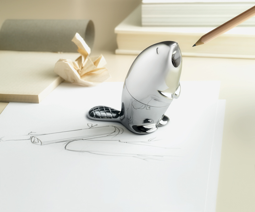
Un taille crayon très castor

Je ne suis pas du tout fan de la marque Alessi.

Mais je trouve tellement adorable le design de leur taille crayon sous forme de castor ! Qui d'autre est à la hauteur pour tailler vos crayons?

"Kastor" a été créé par Rodrigo Torres (designer italien basé à Milan) pour Alessi. Cet objet design a été présenté au dernier Maison&Objet (Paris, 18-22 Janvier 2013).

Je me demande si il imite le bruit du castor quand il "ronge" les crayons?

Il est disponible sur Orgone Design au prix de 42 euros (TTC/hors frais de port).

[caption id="" align="aligncenter" width="589"]Kastor by Rodrigo Torres pour Alessi "Kastor" by Rodrigo Torres pour Alessi (Photo source: Elena Datrino via Design Boom)[/caption]

samedi 16 février 2013

Charming DIY Home Decor Accessories - Guest blogging

Apportez une touche personnelle au décor de sa maison avec des accessoires DIY

Accessories in a house are like cherry on cake. In fact, home decor accessories adorn and complement the style of your home decor theme whether traditional, contemporary or eclectic. DIY home decor accessories help to create an inviting and personalized ambience in your home. So bring out the very best in your living area by utilizing charming DIY home decor accessories to make your home a heavenly abode.

  • Personalize [Personnalisez]

Personalize your living area with charming DIY home accessories, which are custom made to exhibit your family. For instance, you can use any photo software program to polish an old black and white family picture into an exciting new photo.

Proudly flaunt your kid’s artwork by displaying it in a nice frame rather than placing it on top of your refrigerator or some table. Alter the art contents on a frequent basis to house various school projects of your kid.

Anything that conveys a special and unique meaning to you or your family members is excellent to consider as a DIY home decor accessory. For instance, use an old walnut shelf that your dad made for you during your high school days to use as shelving to store your favorite glass bottle.

  • Tap the Available Materials [Servez-vous de matériaux à disposition]

Start searching your house to check the availability of any materials to create DIY home decor accessories. A vivacious silk scarf will give an awesome look if draped on a side table. Set up a classic blue color aluminum water pitcher that is filled with a cluster of silk flowers atop a table cover for a complete look.

Vintage linen truly is a versatile material that is best to accessorize your home. Consider sewing a handkerchief on your pillow and place it in your guest bedroom or exhibit an old lace in a classic and antique wooden frame. Further, an organdy apron from the past can be draped over a rod for your kitchen window for an excellent pelmet.

Fanciful DIY home decor accessories help to create some interest quite gracefully. Put all the collectible pool balls into a big silver bowl that you usually use for special dinners.

  • Consider the Function [Considérez la valeur fonctionnelle de l'accessoire]

DIY home decor accessories for your home can be attractive as well as useful. Another fun trick is melting a vinyl record and then shaping it in a bowl form for holding your remote controls.

For a home office, consider using an old trophy for organizing pencils and pens. Polish the finish on a classic brass mailbox for hanging it onto the wall and then using it for storing blank envelopes.

Do not refrain from experimenting when it comes to creating charming DIY home decor accessories. You never know as a mistake might turn out to be something highly impressive and useful home decor accessory.

Matt Walker is a pro content writer. You can find his articles on home decor niche at www.rugsandblinds.com.

mercredi 12 septembre 2012

Bruxelles et son marché du design

Habituée inconditionnelle de ce marché du design couvert ayant lieu à Tour & Taxis.

Dimanche 09/09  l'entrée est gratuite. Toutefois cette année, il y avait un petit twist: il fallait s'inscrire pour avoir l'accès gratuit. Sinon le PAF était de 5 euros.

Plein de belles choses ... difficile de choisir.


[caption id="attachment_891" align="aligncenter" width="224"]Brussels Vintage Market - vue d'intérieure Brussels Design Market - vue d'intérieure[/caption]

[caption id="attachment_892" align="aligncenter" width="224"]Brussels Vintage Market - vue d'intérieure 2 Brussels Design Market - vue d'intérieure 2[/caption]

[caption id="attachment_893" align="aligncenter" width="225"]Brussels Vintage Market - vue d'intérieure 3 Brussels Design Market - vue d'intérieure 3[/caption]

Mon choix s'est porté sur 2 articles:

[caption id="attachment_894" align="aligncenter" width="300"]Une lampe en laiton et faux sucres colorés Une lampe en laiton et faux sucres colorés - vue éteinte et vue allumée[/caption]

[caption id="attachment_895" align="aligncenter" width="300"]Un petit canapé 2 places rétro - sans le chat Un petit canapé 2 places rétro - sans le chat[/caption]

Source des photos: mesdecovertes.com est l'auteur et détient les droits.

lundi 27 août 2012

Fab.de

Qui connaît?

C'est en regardant une vidéo sur youtube ... une publicité pour ce site fab.de clignotait.

Qu'est-ce?

Ventes éphémères d'objets design (à prix abordable).

[caption id="" align="alignnone" width="386"]Fabe.de logo Fabe.de logo[/caption]

Eh bien j'ai craqué  .. J'ai acheté 2 posters de Lab Partners (23 euros au lieu de +- 30 euros) :

[caption id="" align="alignnone" width="450"]California Gold No.4 - Mountain Lion Poster - California Gold No.4 - Mountain Lion[/caption]

[caption id="" align="alignnone" width="450"]Poster - California Gold No.5 - Hawk Poster - California Gold No.5 - Hawk[/caption]

1 mois d'attente pour les recevoir. En fait fab.de passe effectivement commande une fois la vente clôturée et comme ces posters viennent des USA ... Rien n'est de stock.

Logique économiquement intéressante ... il n'y aura pas d'invendus. Une gestion limitée des stocks.

Toutefois cette logique but sur un problème: que fait-on quand le poster est endommagé? Son remplacement est impossible. C'est ce qui m'est arrivé: un gros coup d'ongle dans la tête de l'aigle avait enlevé la belle couche d'encre noire. :-(

De suite j'envoie un email au support avec photos à l'appui, je twitte  et je téléphone ... et là cela se complique! Un 0800 est bel et bien proposé en-dessous de la zone de login mais depuis la Belgique tu arriveras en Californie (c'est pas une blague: le monsieur à l'autre bout de la ligne était tout perdu d'entendre ma requête). En fait le 0800 n'est que pour l'Allemagne (fab.de est allemand à la base ... mhoui l'extension du site ne s'en cache pas).

Donc je cherche un autre numéro sur le site et je trouve +49 ...  Là je tombe sur un autre Monsieur. Très sympa, il accepte de rembourser le poster sur base de la photo (oui, en ligne il recherche mon email). Mais bon je reste avec une affiche abîmée.

Même si ce fut un peu laborieux ... la fin de l'histoire fut satisfaisante.

Verdict?

fab.de est un beau site et facile à naviguer. Il met en vente de très chouettes articles. Mais malgré une interface en anglais, le service est d'abord orienté vers le marché allemand.

Bon cela ne m'arrêtera pas à faire de futurs achats sur ce site ...

mercredi 27 juin 2012

Rénovation verte – Section peinture – Peinture à l’argile (Part 2)

Dans la première partie de cet article, je vous parlais des différentes marques (Eco Tinto et Olterre) de peintures à l'argile que j'ai employées dans la décoration murale de ma maison.

Cette fois-ci, je vais vous parler des avantages et de mon expérience avec la peinture à l'argile.

Avantages


  • Elle a un très bon pouvoir couvrant quelque soit le support (excepté le bois): fermacel, anciennes peintures laquées, gyproc, ...

  • La peinture à l'argile est respirante.

  • Sans odeur, elle peut donc s'appliquer là où l'on vit sans devoir quitter son habitat de peur d'être intoxiqué.

  • Il est possible de colorer la peinture à l'argile avec des pigments naturels mais Eco Tinto, Olterre ou Galtane possèdent une très belle gamme de couleurs (peut-être limitée mais au moins le choix est moins difficile).

  • Elle a un pouvoir de régulation de l'humidité. ATTENTION: cela ne signifie pas que c'est une peinture propice aux salles de bains!

  • Elle a un aspect mat et velouté très doux. Eco Tinto possède aussi une gamme plus structurée (plus granuleuse) qui donne un aspect plus rugeux à la surface.

  • Le nettoyage des outils se fait à l'eau et très rapidement.

  • Prête à l'emploi chez Eco Tinto et Galtane. Pour Olterre il faut faire le mélange à l'eau soi-même (sans soucis ... c'est comparable à faire une pâte à pain). Ainsi, en fonction de la quantité d'eau ajoutée, vous pouvez obtenir la consistance que vous désirez.

  • Libre de tous solvants (tout à fait recommandée pour une chambre d'enfant et quand on a des animaux domestiques).

  • Elle est applicable autant sur les murs que sur les plafonds.

  • Ne tache pas ... si vous en giclez sur le sol, il suffit de nettoyer de suite avec une loque humide ou de laisser sécher et puis gratter (bon sur un plancher ... vaut mieux nettoyer de suite sinon cela rentre dans les fibres du bois)

  • Elle remplie bien les petites aspérités du mur. Et même si elle ne le fait pas complètement ... par son rendu mat et velouté ... on crée un effet "pierre naturelle" assez intéressant. (voir ci-dessous)


[caption id="attachment_689" align="aligncenter" width="350"]Dépression murales recouvertes d'Eco Tinto "normal" Dépression murales recouvertes d'Eco Tinto "normal"[/caption]


A la lecture de cette longue liste ... on ne peut que dire: Oui, je veux cette peinture chez moi.

Ce qui m'a le plus épatée dans cette peinture: 

  1. On peut aisément peindre la nuit.
    Lorsqu'on applique la peinture à l'argile sur les murs, elle est translucide et elle s'opacifie en séchant. Cette propriété de l'argile est très intéressante quand on peint en blanc (en particulier quand on peint du ton sur ton). Ainsi on ne rate rien ! :-) Plus besoin de grosse lumière allogène rasant les murs pour pouvoir situer son dernier coup de rouleau (humide).

  2. On peut faire facilement des retouches avec le doigt.
    J'ai des chats qui font des taches avec leurs pattes ... pas graves, je reprends mon pot et j'emploie mon doigt comme pinceau pour camoufler localement l'élément disgracieux. Il n'y a plus besoin de refaire tout le mur.

  3. On peut appliquer autant avec un rouleau qu'avec un pinceau. En séchant les traces du pinceau disparaissent.

  4. On peut s'en sortir sans quasi une tache sur soi (ce qui est rare pour moi!). Quand je peints ... c'est comme si je participe à un jeu de paint-ball.

  5. Je l'ai appliquée directement sur le plâtre sans nécessairement avoir préparé les murs avec un primer au préalable.


Le tout petit bémol

Elle n'est pas lessivable ... donc ne l'employer surtout pas prêt d'un point d'eau.

J'ai déjà tenté de nettoyer des taches ... cela fonctionne sans problème. L'argile "se remouille" pour ressécher aussi vite. Mais vous avez une différente texture qui se crée ... c'est-à-dire différente de l'empreinte du rouleau.

Entre les marques employées laquelle ai-je préférée?

Eh bien j'ai autant adoré Eco Tinto qu'Olterre. Toutes les deux sont faciles et avec le même pouvoir couvrant.

Toutefois:

  • Avec Olterre, vous n'aurez jamais un blanc parfait ... vous n'aurez jamais un blanc à la "Dash". J'ai fait le mélange avec de l'eau de ville et avec de l'eau de pluie ... c'est blanc mais il y a un soupçon rosé. Eco Tinto offre un vrai blanc appelé "Mont blanc".

  • Eco Tinto offre deux types de texture. La collection "structurée" qui présente une charge de matière plus importante est tout à fait adéquate pour des murs qui ne sont pas "lisses" et pas parfaits. Elle cache bien les défauts. Votre mur sera plus présent, plus tactile.

    [caption id="attachment_688" align="aligncenter" width="300"]Eco Tinto - Structuré Eco Tinto - Structuré[/caption]

  • Olterre est tout à fait naturel. Eco Tinto possède comme même un stabilisateur chimique (COV restant très faible).

  • Eco Tinto offre aussi un imperméabilisant. Bon, je l'ai testé pour ma cage d'escalier ... mhoui. Pas trop convaincue. Il "éteint" l'aspect velouté de l'argile.


D'ici 2 ans, je vais tester Galtane. Je vous dirai quoi.

P.S.: J'ai vu que Brico avait plus dans ses rayons ECOLAN qu'Eco Tinto. Snifff!


Sources photos: medecovertes.com est l'auteur des photos et en détient les droits.

vendredi 22 juin 2012

Rénover un escalier - un miracle

Ce ne fut pas une mince affaire. Imaginez-vous décaper 6 volets d'escaliers sous une "magnifique" couverture de vieux vinyl collé au bitume. Et voilà ce qui vous reste encore à décaper: une masse brune incrustée dans le bois.

[caption id="" align="aligncenter" width="332"]mes escaliers avant rénovation Mes escaliers, la couche de vinyl enlevée[/caption]

On a tout essayé pour décoller cette masse: acide, soude & co. Il aurait fallu sabler mais étant en intérieur il en était hors de question.

On a découvert qu'à l'origine les escaliers étaient peints et on pense que cette peinture comportait du plomb (une technique que l'on a retrouvé sur tous les planchers de la maison). De la colle de bitume + peinture au plomb = Un véritable cocktail molotof!  Toutes les ponceuses se sont cassées les dents.

Qu'avons-nous fait? Pleurer? Au début ... ;-)

On avait pensé recouvrir les escaliers d'un tapis ... mais bon comme c'est moi-même qui fait le ménage ... Neinh!

On a finalement trouvé une technique miracle: des marches moulées (+ contre-marches) à coller composées d'une couche de chêne brut sur un chassis en pin.

[caption id="" align="aligncenter" width="332"]mes escaliers en cours de rénovation Mes escaliers en cours de rénovation[/caption]

Au début je n'aimais pas à cause de la bande de caoutchouc ( qui s'avère à la longue être nécessaire quand on a des enfants courant en chaussettes ).

Mais après un bon huilage (de ma composition: un mélange d' huile de lin, thérébentine et un peu de sécatif) ... je suis très contente du résultat.

[caption id="" align="aligncenter" width="332"]mes escaliers rénovés Mes escaliers rénovés[/caption]

J'ai trouvé ces marches chez un ébéniste (Gede Bois - Ch. de Wavre - Bruxelles)  dans ma localité. Le prix : 80 euros pour la marche (+ contre-marche) ... mais suite à une erreur on les a eu à 30 euros/marche (découpe comprise).

Un véritable miracle à tous points de vue!


Source photos: mesdecovertes.com est auteur des photos et en détient les droits